Quiet. Bright.
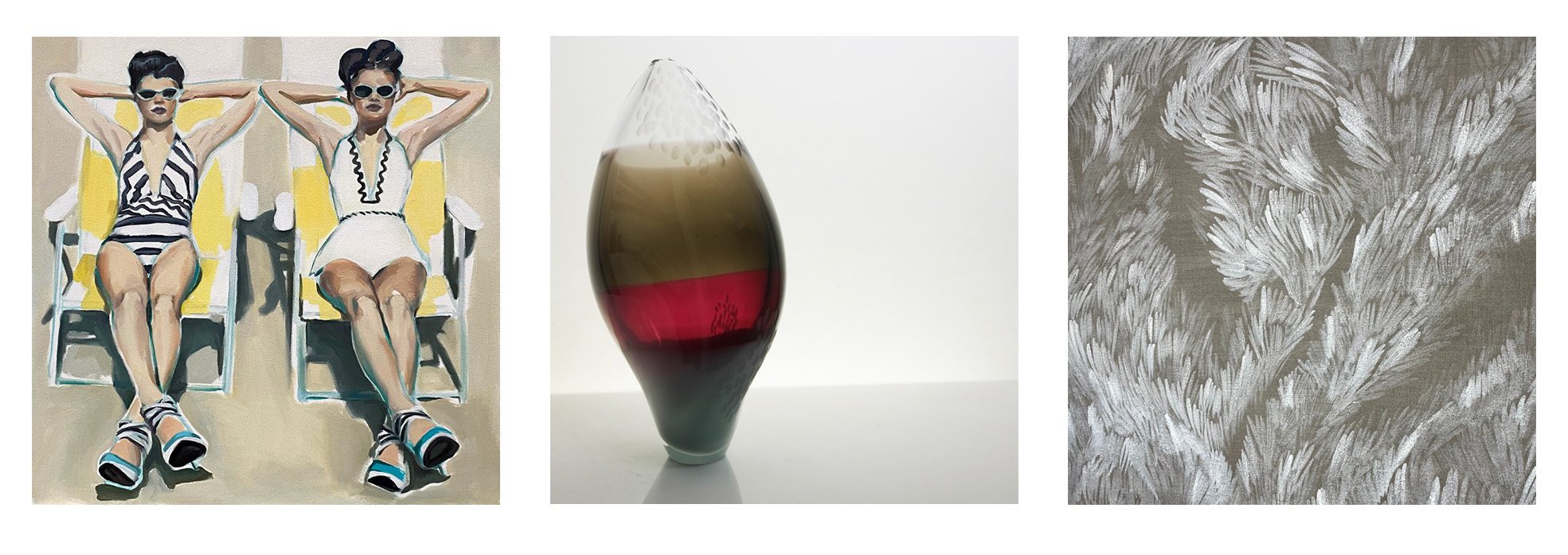
Low saturation and high brightness; ‘quiet but bright’; and containing less grey than other colours: these are qualities of the colours employed by the painters in Quiet.Bright. Such pastel colours are often associated with calming and peaceful vibes, especially in relation to design, fashion and home decor. They have a soft look that is soothing and easier on the eyes. However, tone down the brightness even slightly and - as in the work of Luc Tuymans - a pale palette can also suggest detachment, traumatic recollection or contemplation in general, adding an uneasy or wistful edge to the stereotypical peacefulness we associate with these colours. Further back in art history, painters such as Agnes Martin have explored themes of Beauty, Power and Space through the use of pastels. It is an area of possibility and subtlety. Luxuriate in the way that the paintings in this exhibition play within the limitations of their pale palettes.
Quiet. Bright.
Lea Bridge Library
Lea Bridge Rd
Walthamstow
London
E10 7HU